
Who’s talking? — Using K-Means clustering to sort neural events in Python
Epilepsy is a form of brain disorder in which an excess of synchronous electrical brain activity leads to seizures which can range from having no outward symptom at all to jerking movements (tonic-clonic seizure) and loss of awareness (absence seizure). For some epilepsy patients surgical removal of the effected brain tissue can be an effective treatment. But before a surgery can be performed the diseased brain tissue needs to be precisely localized. To find this seizure focus, recording electrodes are inserted into the patients brain with which the neural activity can be monitored in real time. In a previous article we looked at how to process such electrophysiological data from a human epilepsy patient in order to extract spike events.
Spike sorting
Such spike events as depicted above reflect the activity of individual neurons and therefore can give important insights into the nature of the disease. However as the plot below also illustrates a single electrode will typically pick up signals from more than one neuron at a time. While this might not be an issue for locating the seizure focus, research questions related to the mechanisms behind epileptic seizures often require a more detailed understanding of which neuron was active at what time. So how can we figure out the how many neurons were contributing to our signal and when each of them was active?
Now before we start answering these questions I want to remind you that you can find the Jupyter Notebook with the code for this article here. And of course feel free to follow me on Twitter or connect via LinkedIn.
Spike sorting
Figuring out which of the above spike wave shapes belongs to a certain neuron is a challenging task which is further complicated by the fact that we do not have any ground truth data to compare our results to. So applying an unsupervised clustering algorithm to sort our spike data seems like a good choice. Spike sorting is actually a complex topic and an ongoing field of research and if you want to have a more detailed overview you can take a look here. In the following we will use K-means clustering to sort our spikes and to outline the general process of spike sorting. However it should be noted that in practice K-means is not the optimal algorithm for sorting spikes. As mentioned above there are more sophisticated algorithms available which will yield better results but for illustrating the general process of extracting and sorting spikes K-means well do.
Feature selection
So the first thing we need to do is decide what features of our spike wave forms we want to feed into our algorithm. At the moment each wave form is defined by 90 samples which equals a total duration of ~2.8 milliseconds. However not all samples are equally informative. For example, sample number one of most wave forms fluctuates somewhere around 0. Whereas samples 25 to 30 represent the first positive deflection of the waveform and seem to fall into two groups, one with a high peak and one with low peak. So we should select some features that represent the spike wave shapes well and get rid of the other ones. One way to do so could be going for the max and min amplitude of the spike or its width or timing parameters. Another common approach is to apply principal component analysis (PCA) and use the principal components as features. The PCA implementation with scikit-learn can be found in the Jupyter Notebook to this tutorial. In the figure below the first principal component is plotted against the second principal component while the third component is represented as the color of the dots.
Looking at the plot it seems we have three different and slightly overlapping clusters in our data. One big cluster in the center that is surround by two smaller clusters on the left and right. So what we actually did here is to reduce the dimensionality of our data. While before each spike wave form was represented by 90 samples the dimensionality is now reduced to only three features which allow us to assign each spike to a cluster. And for that we now need our K-means clustering algorithm.
K-means clustering
The way we will implement K-means is quite straight forward. First, we choose a number of K random data points from our sample. These data points represent the cluster centers and their number equals the number of clusters. Next, we will calculate the Euclidean distance between all the random cluster centers and any data point. Then we assign each data point to the cluster center closest to it. Obviously doing all of this with random data points as cluster centers will not give us a good clustering result. So, we start over again. But this time we do not use random data points as cluster centers. Instead we calculate the actual cluster centers based on the previous random assignments and start the process again… and again… and again. With every iteration the data points that switch clusters will become less and we will arrive at a (hopefully) global optimum. Below you can find the Python implementation of K-means as outlined above.
import numpy as np


def k_means(data, num_clus=3, steps=200):


    # Convert data to Numpy array
    cluster_data = np.array(data)

    # Initialize by randomly selecting points in the data
    center_init = np.random.randint(0, cluster_data.shape[0],
                  num_clus)


    # Create a list with center coordinates
    center_init = cluster_data[center_init, :]


    # Repeat clustering  x times
    for _ in range(steps):


        # Calculate distance of each data point to center
        distance = []
        for center in center_init:
            tmp_distance = np.sqrt(np.sum((cluster_data -
                           center)**2, axis=1))
            tmp_distance = tmp_distance +
            np.abs(np.random.randn(len(tmp_distance))*0.0001)
            distance.append(tmp_distance)


        # Assign each point to cluster based on minimum distance
        _, cluster = np.where(np.transpose(distance ==
                     np.min(distance, axis=0)))


        # Find center of each cluster
        center_init = []
        for i in range(num_clus):
            center_init.append(cluster_data[cluster == i,
            :].mean(axis=0).tolist())

   return cluster
Number of clusters
Good, so we are ready to go. We have our spikes extracted from the data, we selected the features and we wrote the K-means function. Now the last question is: How many clusters do we expect to find in the data? There are several ways to approach this question. One would be to use our domain knowledge. From experience we expect not to find more than two or three separable clusters from a single electrode recording. The first plot in this article seems to confirm this notion. Another more objective way is to use the Elbow method. For this we run the K-means function several times on our data and increase the number of clusters with every run. For each run we calculate the average distance of each data point to its cluster center. As the plot below shows, with the number of clusters increasing the average inter cluster distance decreases. This is not too surprising but what we can see as well is that when we reach six clusters the average distance to the cluster center does not change much anymore. This is called the Elbow point and gives us a recommendation of how many clusters to use.
# Define the maximum number of clusters to test
max_num_clusters = 15


# Run K-means with increasing number of clusters (20 times each)
average_distance = []
for run in range(20):
    tmp_average_distance = []
    for num_clus in range(1, max_num_clusters +1):
        cluster, centers, distance = k_means(pca_result, num_clus)
        tmp_average_distance.append(np.mean([np.mean(distance[x]
        [cluster==x]) for x in range(num_clus)], axis=0))
    average_distance.append(tmp_average_distance)


# Plot the result -> Elbow point
fig, ax = plt.subplots(1, 1, figsize=(15, 5))
ax.plot(range(1, max_num_clusters +1), np.mean(average_distance, axis=0))
ax.set_xlim([1, max_num_clusters])
ax.set_xlabel('number of clusters', fontsize=20)
ax.set_ylabel('average inter cluster distance', fontsize=20)
ax.set_title('Elbow point', fontsize=23)
plt.show()
Running the code on the data
Alright, six clusters seems a bit high but lets see what we get. The left plot below shows again the 1st versus the 2nd principal component but this time the color code represents the cluster to which the K-means algorithm assigned each data point. The right plot shows the mean spike wave shape of each cluster.
As we can see from the right plot above our K-means algorithm does a good job at clustering our wave forms. And indeed we have more than three clusters. The mean wave shapes labeled “Cluster 2” in green are the ones with the high amplitude peak. The brown “Cluster 5” is the mean wave shape of the spikes with the low peak amplitude while the orange “Cluster 1” has a lot of noise and a high standard deviation (shaded area). It seems we have a lot of artifacts summed up in this cluster so we should drop it. Finally Clusters 0, 3 and 4 appear identical so we could combine them to one cluster. Doing so will give us four clusters in total, with one of them containing mostly artifacts. So we have more than three but less than six clusters. The plot below shows the resulting three clusters.
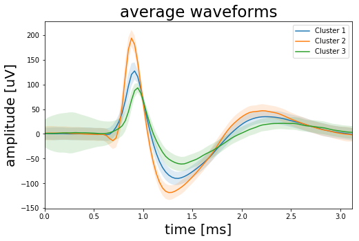
Before we finish we should think again about what these results actually mean. The Elbow method told us to look for six clusters in the data. However from experience we know that this number is a bit too optimistic. So we clustered the data with six initial clusters, looked at the average wave forms of each cluster and then combined three clusters to one based on the similarity of their mean wave shapes. Another cluster we dropped because it contained mainly noise. In the end we have three clusters but does this also mean that we recorded the signal of three individual neurons? Not necessarily. To answer this question we would have to check the data in more detail. For example: After a neuron generated a spike it cannot generate a new spike for 1-2 milliseconds. This is called the refractory period which limits the maximum spike rate of a neuron and ensures that signals only travel from the cell body of the neuron along the axon to the synapse and not the other way around. So if we were to calculate the inter time difference between the spikes of one of the clusters and we would get time differences <1 millisecond we had to conclude that the cluster contains spikes from more than one neuron. Also the brain is pulsating inside the skull which means that the distance between a neuron and the tip of the electrode can change over time, which would effect the wave shape of the spike. So two slightly different wave shapes could still be generated by the same neuron. So in summary we outlined the spike sorting process and the implementation of K-means in Python but all this is rather a starting point than a definite answer to how many neurons were actually contributing to the signal.
If you want the complete code of this project you can find it here. And of course feel free to follow me on Twitter or connect via LinkedIn.