
Visualizing Brain Imaging Data (fMRI) with Python
In the previous article we covered the basics about the data structure and the differences between structural and functional MRI (fMRI). In this article we move on to the analysis of the fMRI data to answer the following question: What brain regions were active during the scan?
This is actually the main objective behind doing a fMRI scan in the first place. While high-resolution MRI scans are performed to get static anatomical insights, fMRI scans aim at getting behind the dynamics of brain functions. In fMRI the b lood- o xygen- l evel d ependent (BOLD) signal is recorded by the MRI machine which is an indirect measure of activity within the brain. In order to perform our analysis we first need to understand how the data was acquired. Was there some sort of stimulus, how long was the experiment running, was there a task involved? So basically we need to know the experimental paradigm.
The experimental paradigm
As we already learned in the previous article the dataset we are looking at is from an experiment were the subject was laying in an MRI machine listening to “ bi- syllabic words”. So our expectation is that we should see a modulation of the BOLD signal (the change in blood oxygenation over time) in brain regions involved in auditory processing. To check if this hypothesis is correct we need to gather more information from the README.txt file of the dataset. Not only is this important to get the dimensions of the scan right but also to put our hypothesis into numbers which in this case means building our design matrix.
>>> block_design    = ['rest', 'stim']
>>> block_size      = 6
>>> block_RT        = 7
>>> block_total     = 16
>>> block_length    = block_size*block_RT


>>> acq_num         = block_size*block_total
>>> data_time       = block_length*block_total
>>> data_time_vol   = np.arange(acq_num)*block_RT


>>> x_size = 64
>>> y_size = 64
So what do these parameters actually mean? First the experiment was a block design meaning that there was a rest period without auditory stimulation followed by a period of playing “ bi-syllabic words”. The total number of volumes acquired was 96 and each rest or stim period was 6 volumes long. This means that there were 16 blocks recorded in total, 8 with stimulation and 8 at rest, always alternating. Finally the time between each acquisition was 7 seconds which allows us to convert the volumes to time in seconds later in this project.
Building our design matrix
With this information we can construct our design matrix, which is basically our expectation of how we think the BOLD signal should be modulated during the experiment for a brain region that is involved in auditory processing. Since later we want to use a general linear model to create our activation map we will already set up the design matrix accordingly even though for now we will omit the constant part for a quick correlation analysis.
>>> import numpy as np
>>> constant = np.ones(acq_num)
>>> rest     = np.zeros(block_size)
>>> stim     = np.ones(block_size)
>>> block    = np.concatenate((rest, stim), axis=0)
>>> predicted_response = np.tile(block, int(block_total/2))


>>> design_matrix = np.array((constant, predicted_response))
So our expectation is very simple, while there is no stimulation the BOLD signal is at a baseline level and during stimulation the signal increases. Below you can see how our design matrix looks like. As mentioned above for now we will ignore the constant part and only look at our expected response.

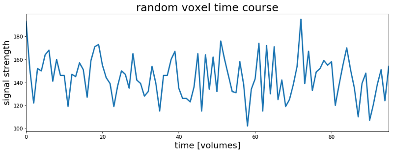
In the previous article and Jupyter Notebook we looked at the timecourse of a random voxel and it didn’t look anything like the expected response above. Plotting another random voxel below also does not look any better. So how can we actually check if there is any voxel in the brain that resembles our expected response?
The easiest thing to do is calculating the correlation coefficient between our expected response and the timecourse of every voxel in the dataset. So first we load a slice from the scan – we saved the data for each slice in an individual .csv file at the end of the previous Jupyter Notebook – and then calculate the Pearson correlation coefficients between our model and each voxel.
# Import the data of one slice
>>> data = np.genfromtxt('./fMRI_data/csv_data/slice_36.csv',
>>> delimiter=',')


# Reshape the data to 2 spatial and 1 temporal dimensions
>>> data_ordered = data.reshape(x_size, y_size, acq_num)


# Calculate the correlation coefficients
>>> c = np.corrcoef(design_matrix[1,:], data)[1:,0]


# Identify the voxel with the highest correlation coefficient
>>> strongest_correlated = data[c.argmax(),:]
You can now plot the voxels timecourse and see if it looks like our simple boxcar model. However as you can see from the random voxel plot and our boxcar model the signal amplitudes on the y-scales are quite different. They are actually apart by a factor of >100. If we want to plot them on top of each other for comparison we should first bring them to the same scale. An easy way to scale a signal to the range of 0 to 1 is min-max scaling:
scaled x = [ (x) – min(x)]/[ max(x) – min(x)]
# Define the min-max scaling function
>>> def scale(data):
>>>     return (data - data.min()) / (data.max() - data.min())


# Scale and plot the voxel with the highest correlation
>>> strongest_scaled = scale(strongest_correlated)


# Plot the timecourse
>>> import matplotlib.pyplot as plt


>>> fig, ax = plt.subplots(1, 1, figsize=(15, 5))
>>> ax.plot(strongest_scaled, label='voxel timecourse', lw=3)
>>> ax.plot(design_matrix[1, :], label='design matrix', lw=3)
>>> ax.set_xlim(0, acq_num-1)
>>> ax.set_ylim(-0.25, 1.5)
>>> ax.set_xlabel('time [volumes]', fontsize=20)
>>> ax.set_ylabel('scaled response', fontsize=20)
>>> ax.tick_params(labelsize=12)
>>> ax.legend()
>>> plt.show()

Actually this looks much better than the random voxel before. So our simple guess of how a brain region involved in auditory processing should respond to the “ bi-syllabic words” was not so bad, or was it? Actually this could be just a coincidence or the voxel we are looking at is located outside of the brain. Therefore it would be helpful to actually see where this voxel and others with high correlation coefficients are located.
To create this map we can plot the first image of the fMRI scan as a reference for the underlying brain anatomy. The fMRI images were acquired by an MRI imaging sequence called “ E cho- P lanar I maging” (EPI) which is why we will refer to them as EPI images from now on. After plotting the first EPI image for reference we can reshape our vector of correlation coefficients to match the dimensions of the EPI image and visualize the resulting correlation map. Finally we can select a threshold for the correlation map and overlay the thresholded map with the first image in the scan to see were the regions with the highest correlation coefficients are actually located with respect to the brain anatomy.
# Reshape the correlation coefficients
>>> corr = c.reshape(x_size, y_size)


# Create a copy of the map for thresholding
>>> map = corr.copy()


# Threshold correlation map -> only voxels with > 0.2 correlation
>>> map[map < 0.2] = np.nan


# Visualize all the maps
>>> fig, ax = plt.subplots(1,3,figsize=(18, 6))
>>> ax[0].imshow(mean_data, cmap='gray')
>>> ax[0].set_title('1st EPI image', fontsize=25)
>>> ax[0].set_xticks([])
>>> ax[0].set_yticks([])


>>> ax[1].imshow(corr,  cmap='afmhot')
>>> ax[1].set_title('un-thresholded map', fontsize=25)
>>> ax[1].set_xticks([])
>>> ax[1].set_yticks([])


>>> ax[2].imshow(mean_data, cmap='gray')
>>> ax[2].imshow(map, cmap='afmhot')
>>> ax[2].set_title('thresholded map (overlay)', fontsize=25)
>>> ax[2].set_yticks([])
>>> ax[2].set_xticks([])
>>> ax[2].set_yticks([])
>>> plt.show()
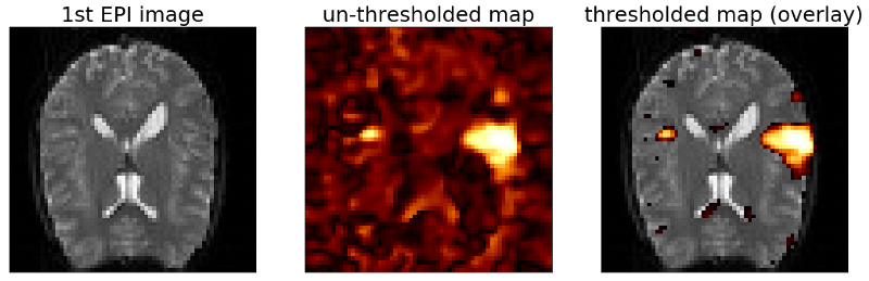
OK as we can see from the un-thresholded map the voxels with high correlations are not randomly distributed across the map but actually form a bigger cluster on the right side and a smaller cluster on the left side of the map. Also we can see from the overlay with the thresholded correlation map that both clusters are located within the brain. The region were they are located is actually the auditory cortex which – as you may have guessed – is involved in processing auditory information. So it seems we are on the right track. However the map looks still noisy. Therefore in the last article of this series we will fit a general linear model (GLM) to the data and see if we can improve on the noise level of the maps.
Meanwhile you can check out the complete code here, follow me on Twitter or connect via LinkedIn.
The complete code for this project can be found on Github.