
Implementing the general linear model (GLM) in Python for fMRI data analysis
In the first article of this series we looked at the general organisation of MRI and fMRI datasets. In the second article we moved on and investigated which parts of the brain were active during the fMRI scan by performing a correlation analysis between the data and an idealized response profile. The method worked quite well. We saw activity in the auditory cortex as expected during auditory stimulation but the map looked a bit noisy and we wanted to see if a general linear model (GLM) might give us better results.
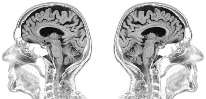 Structural
MRI scan of the human brain (modified from
toubibe)
Structural
MRI scan of the human brain (modified from
toubibe)
What we did so far
But before we move on lets recall how the dataset we are looking at was collected. The data comes from a subject laying in a MRI scanner while an auditory stimulus (“ bi-syllabic words”) is presented periodically. During the auditory stimulation we expect the b lood- o xygen- l evel d ependent (BOLD) signal, which is an indirect measure of brain activity, to increase.
Below you can see the design matrix we created in the previous article which reflects our assumption about the brains response to the auditory stimulus. It consists of two components or regressors as we will call them. The first regressor is a constant which is always at value 1 while the expected response goes from 0 to 1 every time there is an auditory stimulus.

For our correlation analysis we only looked at the “expected response” and ignored the constant part. However now that we want to use a GLM to see which parts of the brain were active we also need the constant part. But before we actually fit the model let’s have a look on what a GLM is and how we can use it with our data.
The General Linear Model
Baisically the GLM is a multiple regression analysis which tries to explain our dependent variable, the BOLD signal, through a linear combination of independent reference functions or regressors as we will call them here. In our case we already defined two regressors in our design matrix, the constant part and the expected response. The GLM is defined as follows:
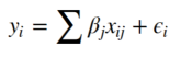
Where i is the i -th observation (volume in time) and j is the j -th regressor (constant or expected response). While ε represents the error term. In the end this means the following: The BOLD signal y of any given voxel is the sum of our constant part multiplied by β0 and the expected response multiplied by β 1, plus some error ε. Now our task is to find the weights β 0 and β 1. For this it is helpful to think again about the kind of data we are dealing with. Each slice has 64x64 voxels and each voxel timecourse contains 96 volumes. This means one voxel is a vector with 96 dimensions. And our design matrix is a matrix with dimensions 96x2. So we can rewrite the above equation in matrix format:
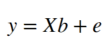
Where X denotes our 96x2 design matrix and b the 2-dimensional weights vector. This means that our error e is the difference between Xb and y :
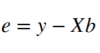
And this error e is what we need to minimize in order to fit the GLM to the voxels timecourse. One efficient way to do this is to minimize the sum of squared errors as shown below:
We can find the β weights quite easy through some simple matrix multiplications. If you are interested in more details about how to get to the equation below you can have a look at this and this link.
Alright now lets put this into code that we can run on our data. The below function takes two arguments as inputs, the design matrix and the fMRI data, and calculates the GLM parameters.
The GLM as a Python function
>>> def do_GLM(X, y):


>>> def do_GLM(X, y):
# Make sure the design matrix has the right orientation
>>>     if X.shape[1] > X.shape[0]:
>>>         X = X.transpose()

# Calculate the dot product of the transposed design matrix
# and the design matrix and invert the resulting matrix.
>>>     tmp   = np.linalg.inv(X.transpose().dot(X))


# Now calculate the dot product of the above result and the
# transposed design matrix
>>>     tmp   = tmp.dot(X.transpose())


# Pre-allocate variables
>>>     beta  = np.zeros((y.shape[0], X.shape[1]))
>>>     e     = np.zeros(y.shape)
>>>     model = np.zeros(y.shape)
>>>     r     = np.zeros(y.shape[0])

# Find the beta values, the error and the correlation coefficients
# between the model and the data for each voxel in the data.
>>>     for i in range(y.shape[0]):
>>>         beta[i]  = tmp.dot(y[i,:].transpose())
>>>         model[i] = X.dot(beta[i])
>>>         e[i]     = (y[i,:] - model[i])
>>>         r[i]     = np.sqrt(model[i].var()/y[i,:].var())

>>>     return beta, model, e, r
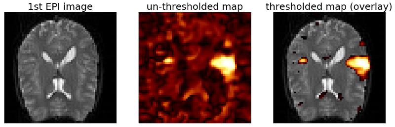
As you can see from the code above there is one more parameter that we are calculating which we didn’t talk about yet. This parameter r is the correlation coefficient of our fitted model and the data, meaning that the square of r is the percentage of variance explained by the model. We can use this parameter to set a threshold for our map as is shown in the following code which runs our “do_GLM” function on the fMRI data and plots the results.
# Run the GLM
>>> beta, model, e, r = do_GLM(design_matrix, data)


# Reshape the correlation vector r to create a map
>>> r = r.reshape(x_size,y_size)
>>> map = r.copy()
>>> map[map<0.3] = np.nan


# Plot the result
>>> fig, ax = plt.subplots(1,3,figsize=(18, 6))


>>> ax[0].imshow(mean_data, cmap='gray')
>>> ax[0].set_title('1st EPI image', fontsize=25)
>>> ax[0].set_xticks([])
>>> ax[0].set_yticks([])


>>> ax[1].imshow(r, cmap='afmhot')
>>> ax[1].set_title('un-thresholded map', fontsize=25)
>>> ax[1].set_xticks([])
>>> ax[1].set_yticks([])


>>> ax[2].imshow(mean_data, cmap='gray')
>>> ax[2].imshow(map, cmap='afmhot')
>>> ax[2].set_title('thresholded map (overlay)', fontsize=25)
>>> ax[2].set_xticks([])
>>> ax[2].set_yticks([])
>>> plt.show()
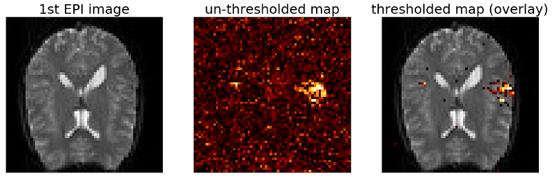
Adding a third regressor
The map above shows two clusters similar to the ones we saw with the correlation map we calculated in the previous article, but it didn’t improve much. However the nice thing about the GLM is that we can now modify the design matrix by adding more regressors. To demonstrate this lets use the mean response of the voxels from the thresholded map above as a third regressor. As noted earlier the amplitude of the BOLD signal can be large in absolute numbers but it can also vary among individual voxels. Therefore it would be good to standardize all the timecourses before averaging them. This is done by calculating the z-score:

Where x is a sample of the timecourse, µ is the mean of the signal and σ is the standard deviation. The function below does the calculation for us.
>>> def z_score(data):
>>>     mean = data.mean(axis=1, keepdims=True)
>>>     std = data.std(axis=1, keepdims=True)
>>>     return (data-mean)/std
Now we can z-score our signals, scale them as we did in the previous post and add the mean to our design matrix.
>>> avg = z_score(data_ordered[~np.isnan(map),:])
>>> avg = scale(np.transpose(avg).mean(axis=1))
>>> design_matrix = np.array((constant, predicted_response, avg))
The resulting design matrix is depicted below and contains the mean response of all voxels with a correlation coefficient above our threshold (> 0.3).

If we now run the code from above again with our new design matrix and plot the resulting maps we see the following.
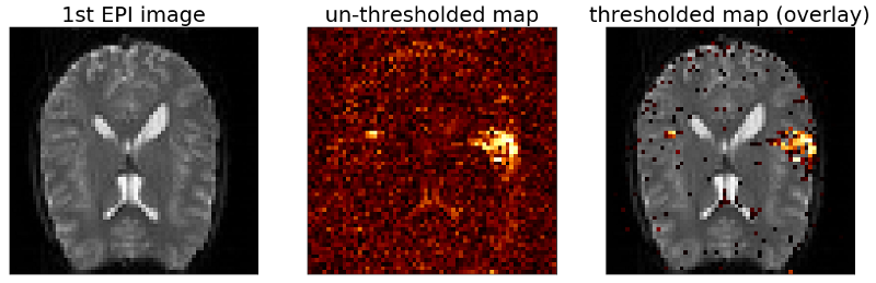
The map still looks comparable to our previous maps but the size of the clusters has increased. Also we see more single voxels above threshold.
What is the best map?
Now is this a “better” result than our previous maps? Not necessarily. Clearly our first approach with the “expected response” is an oversimplification. It does not take into account response latencies of the BOLD signal and other physiological processes that play crucial roles here. So using the average BOLD signal of voxels above threshold is the better option? Again there is no right or wrong answer here. Certainly this timecourse reflects the behavior of the BOLD signal much better than the simple boxcar model. However approaches like this are also more sensitive to artifacts. For example if the subject moved during the scan this will be reflected in the average timecourse so we will end up with maps that reflect the movement and not the response to the stimulus. So as with anything there is no “one size fits all” solution and you really have to ask yourself what and why am I doing what I do.
Reducing noise – spatial smoothing
Now before we come to the end of this article lets see if we can improve on the noise level of our data. One way of doing so is spatial smoothing which can be done by convolving the EPI images with a Gaussian kernel. Here we will not go into the details of how to construct the Gaussian kernel and how to do the 2D convolution. If you are interested in these things you should have a look at the Jupyter Notebook for this article or check out this link for the Gaussian kernel and this one for the convolution.
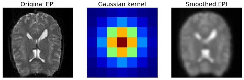
The picture above shows the result of smoothing the EPI images with the Gaussian kernel. Basically it blurs the image by averaging neighboring voxels with different weights. As you can see we loose details but at the same time we also reduce the noise in our EPI images. If we do this with every EPI image in our dataset we get a smoothed timecourse on which we can run the GLM again and get the smoothed activation map below.
As you can see the above map looks cleaner and less noisy than the previous maps. Also the size of our activated area has increased. But as we discussed before we need to be careful with the interpretation of this map. The activated area in this plot may be bigger than it actually is. Also we loose spatial details. On the plus side, it clearly helps us with the noise in the data.
Conclusion
In this series of three articles we looked at the general organisation of MRI and fMRI data. We went from visualizing the static MRI images to analyzing the dynamics of 4-dimensional fMRI datasets through correlation maps and the general linear model. Finally we reduced the noise in the data by spatial smoothing and saw clusters of activity in the auditory cortex of the brain during auditory stimulation.
These three articles were supposed to give you an idea of how brain imaging data from fMRI experiments is organized and how it can be approached to get meaningful insights from it. Naturally this topic is more complicated than can be expressed in this short format but I hope you enjoyed reading along and learned a thing or two.
If you want the complete code of this project you can find it here. And of course feel free to follow me on Twitter or connect via LinkedIn.
The complete code for this project can be found on Github.